A Tale of Two Cities: Len Norris vs Saul Steinberg, Map to Map
by BK Munn
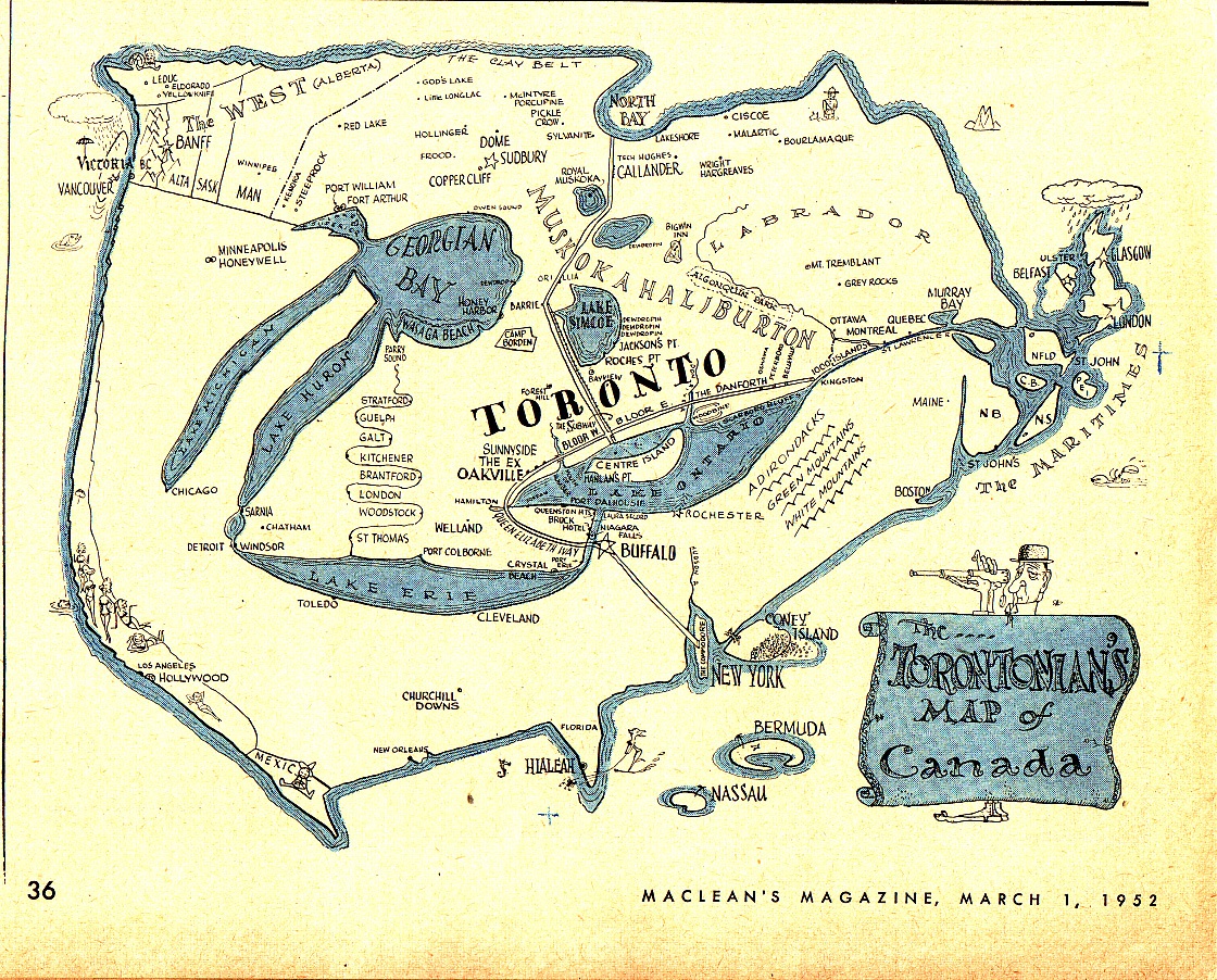
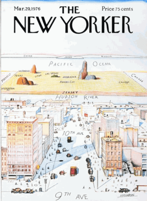 Today we present a stunning new discovery by the cartoonist Seth, who just came into a collection of 200 vintage Maclean’s magazines from the 1950s and 60s. Len Norris‘s great cartoon illustration of a map of North America as imagined by parochial Torontonians was featured in the March 1st, 1952 issue of Maclean’s Magazine, Canada’s most popular weekly. To fans of cartooning, Norris’s drawing instantly reminds us of Saul Steinberg‘s famous 1976 New Yorker magazine cover, View of the World from 9th Avenue. When first published, Steinberg’s arch comment on the myopia of his fellow Gothamites became one of his signature works, not to mention a perfect encapsulation of the magazine’s acerbic outlook. The New Yorker sensibility (notoriously, “not for the little old lady in Dubuque,” in the words of founding editor and publisher Harold Ross), a 50-year-old formula of wit, attitude, and self-parody that had served by 1976 as both a stage and filter for some of the best journalism, fiction, and cartooning in the U.S., is hard to capture in a single image. Rea Irving’s Eustace Tilly, the famous top-hatted fop examining a butterfly first depicted on the inaugural 1925 cover and reprinted annually since, has become the magazine’s mascot, but Steinberg’s 9th Avenue map, printed as a poster and sold around the world for decades, has transcended it’s origins as a throwaway gag because its whimsical absurdity and nuanced themes likely speak to people on many levels.
How surprising then to find the same idea in a Canadian magazine 25 years earlier!
Some notes, looking back through the wrong end of the telescope:
-In contrast to Steinberg, Norris’s Toronto map, whether created through editorial fiat or sui generis artistic impulse, is more specific and limited in its purview, but nontheless tongue-in-cheek. Toronto, which Hemingway called a city of churches while working as a Toronto Star newspaperman in the 20s, is not New York, and was less so in 1952 than today, I imagine. And Maclean’s is not The New Yorker. Indeed, at the time it more closely resembled a skinny, northern relative of the Saturday Evening Post, replete with folksy, illustrative cover paintings and condiment ads with recipes. So we can say each country’s magazine gets the parodic map they deserve.
-Both maps illustrate a certain status anxiety, masquerading as big-shouldered bombast, and function differently depending on point-of-view and degree of self-knowledge in the viewer. Whereas New York, despite its imperial status, crowdedness and crime, has always proclaimed itself “the greatest city in the world,” Toronto’s smug superiority has always been compromised with the knowledge of its own inferiority vis a vis other cities (not just New York but also Chicago. And Los Angeles. And Detroit. Hell, even Buffalo gave Toronto a run for its money for many years!) and the knowledge of how much the rest of Canada resented its power, money, and pride, built as it was (and is) atop a resource economy predicated on extracting surplus value from the work of all those “hewers of wood and drawers of water” out there in the boonies (with subscriptions to Maclean’s). New York figures prominently on Norris’s map, but Toronto is totally absent from Steinberg’s, with the entirety of Canada relegated to a postage stamp-sized triangle in the upper right, somewhere beyond New Jersey but below the sliver of Russia. Norris’ map gives short shrift to every other major Canadian city, most of which don’t rate a dot bigger than Orillia. Rainy Vancouver is cloud-covered and no match for bikini-stuffed Hollywood. Montreal is notable for its proximity to the Thousand Islands and rates lettering the same size as Bloor Street. Calgary, Edmonton, Regina, and Saskatoon are missing, but Banff rates a large star. Etc.
-Canadian critic Robert Fulford described Steinberg’s map as depicting the entire world as a suburb of Manhattan. Norris’s Toronto is unconcerned with the rest of the world beyond its actual suburbs, offering a view of the rest of Canada as a hinterland playground. Norris gives prominent space to daytrip destinations a few hours outside of the city, quaint little towns like Stratford, Guelph, and London, and that vast expanse of Ontario known as “Cottage Country” –the network of parks, lakes, and tourist traps that middle-class Torontonians escape to for weekends and holidays (in fact, comically exaggerated scale excepted, the whole thing resembles one of those tourist maps, printed on tablecloths, hand-towels, and menus, and once so ubiquitous at rest-stops, campsites, and gas stations across the continent). The rest of Canada, if not known as a vacation destination, perhaps sporting a hunting or fishing lodge, or as a resource-rich lumber or mining operation familiar to Bay Street investors, is left blank (even New York is almost eclipsed by Coney Island!).
-Norris’s map illustrates a Toronto-centric idea of Canada at mid-century, amidst a booming post-war economy rich in leisure time for an expanding urban class slightly nostalgic for the simplicity of small-town and rural life from which it grew, and willing to buy it back in idealized, pre-packaged, commodified form, either as a weekend getaway or stock certificate. In a way, we can look at Maclean’s Magazine in a similar light. A national magazine based in Toronto, tasked with bringing news and entertainment to the far-flung provinces of the commonwealth, Maclean’s had something of a tightrope to walk, selling a singular vision of Canada to a disparate, atomized population. It did this largely by creating a new visual, slightly sophisticated suburban idea of the country through illustration, cartoons, and advertising, while occasionally poking fun at itself and its big city home.
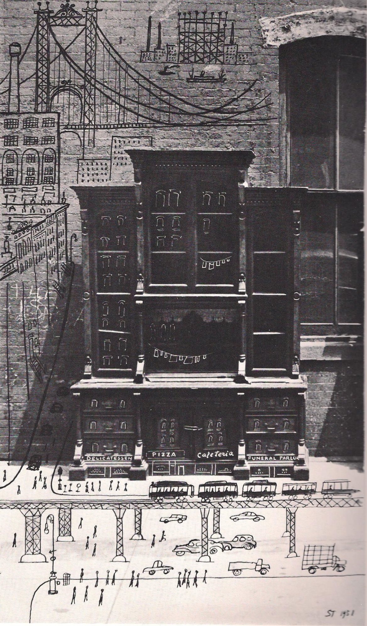
-Both Steinberg and Norris shared a cosmopolitan, much-travelled sensibility. Steinberg, the Jewish-Romanian refugee, was famously shunted around Europe and the Caribbean before being allowed to emigrate to the U.S., where he was promptly drafted and sent back to Europe. Afterwards he never seemed to stop traveling, criss-crossing the globe and the U.S. as a tourist, minor celebrity, and reporter, while remaining a loyal New Yorker, both in the city and magazine sense. The English-born, Canadian-bred Norris fought Franco’s fascists in Spain before joining the Canadian armed forces for WWII. His bemused, byzantine cartoons and advertising work for all aspects of print media in Toronto, but mainly as art director and staff cartoonist for Maclean’s, and later as political cartoonist for the Vancouver Sun, display a satiric attitude towards all forms of provincialism, whether embodied by average joes in British Columbia or captains of industry in Toronto.

-Cartoon cityscapes show up even earlier in Steinberg. There’s a nice one of an idealized (though occupied by cartoon jeeps and G.I.s) Italian town in All in a Line, his 1945 book of wartime drawings completed during his stint with the U.S. Army. Other precedents, like “Eighth Street” (1966), a barren landscape peopled with allegorical figures and buildings perched on the horizon, and “March-April” (a 1966 New Yorker Cover), featuring a Steinbergian cat bicycling over the bridge between Winter and Spring, with grey February far away on the horizon, show the artist playing with ideas of geography, egotism and short-sightedness in graphic form from an early date, 10 years before the 9th Avenue cover.
Thanks to Seth for sharing “The Torontonian’s Map of Canada” with us!